

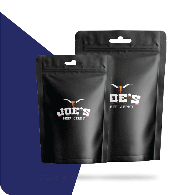
Deciding how a pouch should actually look is often harder than choosing the film or closure underneath it, since so many visual directions could technically suit dried meat. Beef Jerky Bags offer a surprisingly small canvas where one clear style choice usually performs better than several competing ideas crammed onto a single front panel. That early decision becomes considerably easier for a maker just starting out, once the main style directions available are understood. The most common approaches, along with where each performs best, are explained below, one at a time.
Rugged Outdoor Styling For Adventure Appeal
Earthy colour palettes, bold block lettering and imagery evoking mountains, campfires or wide open trails suit jerky marketed toward hikers, hunters and outdoor enthusiasts. This style typically pairs matte finishes with a rustic kraft background, reinforcing a sense of authenticity and ruggedness at a glance. Outdoor styling works especially well on convenience store shelves, where a bold, masculine look stands out quickly among softer, more delicate snack packaging.
Clean Minimalist Design for a Modern Audience
Generous white space, a single accent colour and simple sans serif type suit brands targeting health conscious shoppers who associate clutter with lower quality ingredients. This style photographs cleanly for online listings and social media, where a crowded design often looks chaotic in a small thumbnail image. Minimalist layouts are also relatively forgiving to print, since fewer colours reduce the risk of registration errors across a large production run.
Bold Flavour Driven Graphics
Multiple options are sorted through quickly on a crowded shelf when vivid colour blocking is tied to specific flavours, such as deep red for spicy varieties or warm amber for teriyaki. Playful typography and short, punchy flavour names reinforce this approach, giving each variety its own distinct visual identity within a shared family style. Flavour driven graphics suit brands with several varieties competing for attention side by side.
Artisan and Small Batch Visual Cues
Hand lettered type, a simple illustrated logo and uncoated kraft stock together suggest a small, carefully made product rather than a mass produced one. This style resonates strongly at farmers markets and specialty shops, where shoppers actively seek out products that feel personal and locally made. Artisan styling typically relies on one or two ink colours, keeping production costs low while reinforcing the handmade impression the design aims for.
Dark Palette for a Refined Position
Deep black, charcoal or navy backgrounds paired with metallic gold or copper accents suggest a more refined, higher priced product positioned above everyday convenience store jerky. Coated stock, and sometimes foil stamping, is usually needed to achieve the intended sheen and depth of colour with this style. Dark upscale styling suits gift sets, subscription boxes or jerky positioned specifically as a gourmet snacking option.
Photographic Styles Showing the Product Itself
Quality is sometimes communicated more directly through a close up photograph of the actual jerky, glistening and textured, than through any illustration or abstract pattern. Careful, appetising food photography and a higher print budget are both needed to reproduce colour and detail accurately with this approach. Photographic styles work particularly well for higher end lines where the product’s texture and marbling are part of the overall appeal.
Questions That Narrow Down a Style Choice
A short set of questions usually points toward the style best suited to a specific product and audience. The list below is worth working through before a designer begins.
- Target audience and where the product is typically sold
- Price point and whether a gourmet feel is intended
- Print budget available for finishes and coated stock
- Number of flavours needing distinct visual treatment
- Existing brand voice across any other marketing materials
- Production timeline for sourcing specific paper or finishes
Testing a Style With Real Mockups
A handful of rough mockups, viewed on screen and then printed as physical samples, reveal far more about how a style actually performs than imagining it in the abstract ever could. Sharing these mockups with a few trusted customers or colleagues before a large print run often surfaces a clear favourite quickly.
Keeping Flavour Variants Visually Consistent
A product line looks organised, even as individual colours change from one variety to the next, when a shared style framework is applied consistently across every flavour in a range. Straying too far from this shared structure for a single flavour risks making the whole range feel disjointed and harder for a shopper to recognise as one family of products.
Getting Style Guidance From a Supplier
Narrowing down a style becomes considerably easier with input from a supplier who has produced many different jerky pouch designs across varied price points. Universal Packaging shares examples spanning rugged outdoor, minimalist, artisan and dark upscale palette approaches, with printed samples supplied so a chosen direction is judged by hand before a full commitment is made.
Conclusion
No single artwork style suits every jerky brand, and the right choice depends heavily on audience, price point and the specific shelf where a product is expected to compete. Rugged outdoor looks, clean minimalism, bold flavour graphics, artisan cues, dark upscale palettes and close up photography each tell a different story to a shopper scanning past quickly. Testing a chosen direction with real mockups, rather than relying purely on instinct, catches a mismatch before thousands of pouches are printed. Guidance on choosing and refining an artwork direction for a specific jerky line is offered by Universal Packaging. A well chosen style, matched honestly to the product inside the pouch, earns attention for exactly the right reasons.